
Learn how to use the psychology behind colors to influence behavior and increase your sales online
Do you understand how to convert website viewers into customers? Do you understand what on your website attracts them and makes them choose to purchase from you?
Utilizing certain color-placement methods affects how consumers shop online. However, there are several misconceptions about why the psychology behind colors influences buyer decisions.
For instance, red is a color largely associated with danger, excitement, and urgency. Many business owners act on this knowledge alone. If you want a web visitor to get excited about making a purchase, you should place a big red button on the page saying “BUY ME NOW!”, right?
Wrong. The psychology is never that clear cut. A red flashing button may not convert any better than a green one.
Color isolation, however, can have a drastic effect on consumer perception and behavior. By carefully layering color palettes to highlight important areas on your webpage, you can influence higher click rates and conversions.
The isolation effect for beginners
When a web visitor scrolls through your website, how do you draw their attention toward a specific link or call to action (CTA)?
You make it stand out.
The psychological principle known as “The Isolation Effect” states that when an item “sticks out” from its surroundings, the more likely it will be recognized and remembered. So, in theory, it doesn’t matter what color you choose for a CTA, so long as that color draws attention from the reader.
If your homepage has a light blue background with purple accents, a bright red button will likely attract more clicks than, say, a green one. However, if your homepage has an orange color scheme, a red button might not be as effective. Why? Because it won’t stand out from the orange background.
What’s important to understand: the layering, coordination and isolation of colors will impact consumer behavior online. Color associations (red means danger, blue means relaxed) do not influence consumers on their own.
How to use the isolation effect to create visual hierarchies
Color isolation is a useful tool for converting web visitors. You can focus the reader’s attention on specific areas by contrasting and unifying colors throughout the web design.

Let’s take the Blitz homepage as an example. The color scheme is two colors (dark blue and bright green) over a gray and white background. The layout of the text is blue, and the accent color is green. The graphic icons contain each color, creating harmony and unity on the page.
~ ~ ~ ~ ~ ~
“The Isolation Effect” works wonders for click rates, but how do you manage those leads once they start flowing in? We can help you take your lead conversions and follow up to a new level. Click the link to find out more!
![]()
Sign up with Blitz today for a 30-day free trial.
~ ~ ~ ~ ~ ~
At first glance, what is the one thing you notice? The orange button. It contrasts from orange everything else on the page. That color was chosen to draw attention to itself. Not coincidently, that button is a call to action asking people sign up for our software products.
Here are two great examples of color isolation. Hulu and Netflix are big competitors with very similar website designs and purposes.
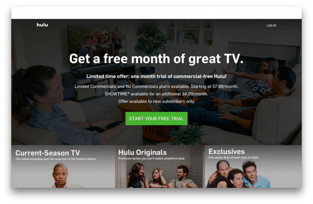
Both websites utilize a simple color scheme: Hulu uses a dark gray background with white text; Netflix has a black background and white text.
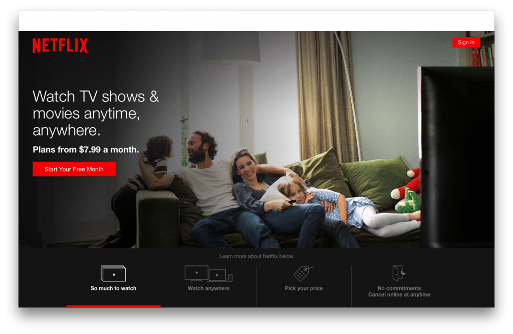
Glancing at both pages, you can see–immediately–where they want you to click: the red and green buttons. Both colors have effectively isolated their calls to action.
Placed side by side, with the same number of page views, which CTA do you think receives more clicks? Does Netflix’s red button look more enticing than Hulu’s green one?
Probably not. The psychology behind colors goes deeper than simple associations. What matters is how you present those colors to the reader.
Here is a breakdown of the competitors’ websites and how they draw attentions to their CTAs:
Netflix:
The isolated red buttons align with Netflix’s brand. Up in the left-hand corner, the Netflix logo is also red, as well as the “Sign in” button on the right side.
The buttons at the bottom of the page are outlined in red, too––everywhere they want you to click is clearly highlighted.
The Netflix homepage creates more unity and invites brand recognition along with the call to action.
Hulu:
Hulu is more technical with their placement strategy. The isolated green button centers the page and immediately grabs the viewer.
Notice how each line of text above the CTA is shorter than the last, creating a pyramid structure that points down at the green button. Each line of text has a smaller font, too, encouraging readers to focus as they read from top to bottom.
Hulu doesn’t use green in any other part of the page. The CTA stands out from everything else.
Don’t rely on standalone associations
The psychology behind colors is frequently over simplified. Looking at the associations alone, red CTAs will not perform better than green or blue ones. What matters is how your web page creates a visual hierarchy. What colors stand out and grab attention?
~ ~ ~ ~ ~ ~
“The Isolation Effect” can work wonders for click rates, but how do you manage those leads once they start flowing in? We can help you take your lead management and customer follow up to a new level. Click the link to find out more!
![]()
Sign up with Blitz today for a 30-day free trial.
~ ~ ~ ~ ~ ~
Do you utilize the isolation effect on your website? What success have you had with certain color schemes or CTAs? Share your story and continue the conversation!